Live Dashboard
An interactive lobby experience that informs, educates and entertains users through meaningful stories around a business
ABOUT
The latest advancements in data visualization have empowered enterprises to understand more about their businesses in real-time. With the latest abilities to interact with data, businesses are no longer just passively viewing it, but are crafting stories to let their employees experience data. Such interactive experiences are beginning to empower employees with the ability to discover more about their businesses in real-time.
Public spaces such as corporate lobbies and the likes of executive briefing centers are increasingly being used to tell stories through museum-like exhibits and larger-than-life visualizations. With the potential to reach large internal and external audiences, these platforms pave the way for new engagement methods that create lasting impact.
Live Dashboard is an interactive lobby experience that enables brands visualize and experience real-time complex business data in new and familiar ways.
Whether it is a company’s employees in an open office space or their customers passing by their lobby, Live Dashboard captivates everyone.
CHAPTER ONE
Understanding the problem space
While marketing to customers is important, the very people who can make the brand come alive for your customers – the employee workforce are an important market too. As the shift towards data storytelling grows, brands are adopting data visualization for far more than business intelligence and insight, to create informative experiences that engage their employees. In designing one such experience, our research and immersion into the domain was instrumental in yielding a clear design challenge.
1
“How can we use visualization to enhance awareness, influence participation and social interaction?”
2
“How can we show data in a way that is both familiar and new?”
CHAPTER TWO
Defining experience goals
By aggregating data across all commerce and content sites, Live Dashboard tells simple stories about a brand and its customers, in a manner consumable by those unfamiliar about the domain. The display visualizes a company’s website activity in real-time, telling stories that have the following goals:
1
Inform
Employees discover more about their company in-real time
2
Educate
External audiences understand how the brand drives conversations
3
Entertain
Deliver delight and emotional impact through rich visuals and animation
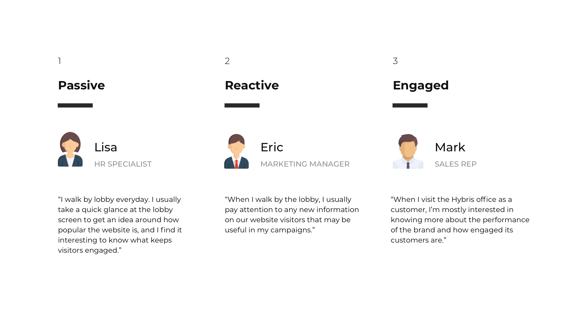
Live Dashboard leverages the potential of social and public spaces to inform and entertain internal and external audiences, paving the way for new engagement methods that create lasting impact. In designing a range of experiences, we identified 3 user types.
One of the main challenges with designing an experience for ‘all users’ was to define content that was consumable by potentially, the entire workforce. The project was an experiment undertaken by SAP Hybris to foster more engagement amongst its employees, and as such we experimented with creating simple stories around the SAP Hybris website.
CHAPTER THREE
Designing the experience
Designing an interactive exhibit for a public space required us to factor a range of experiences with users within and away from the display’s vicinity. The design of the main visualization was largely inspired by installations, digital signage and large public displays that present information in captivating ways.


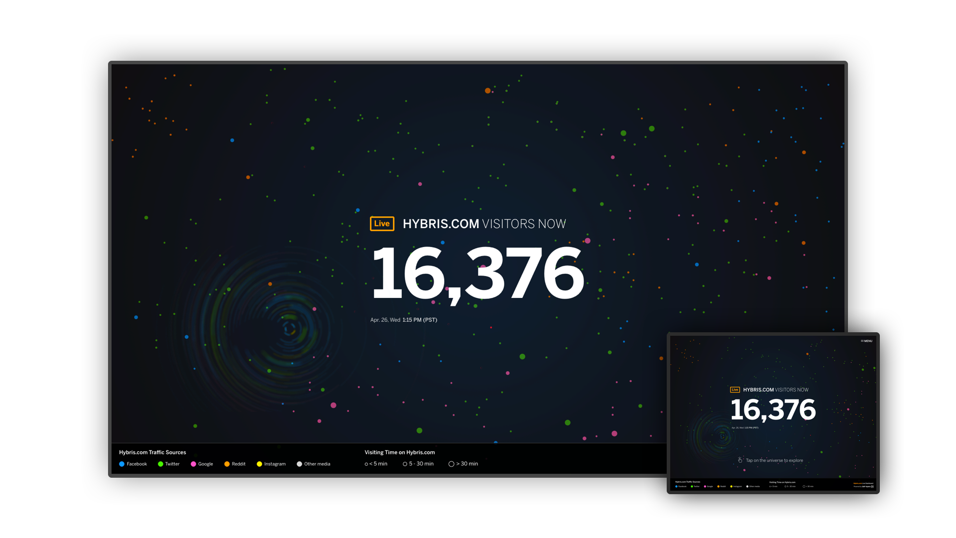
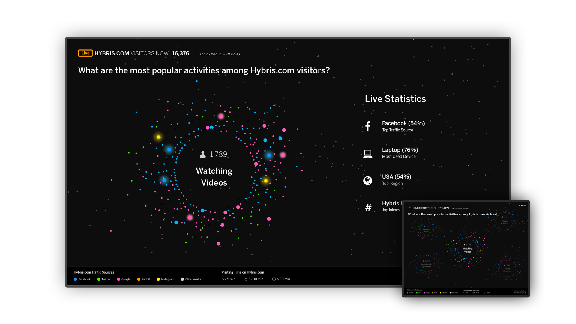
The central theme is a dynamic moving composition that represents website activity, through a ‘data universe’ that emphasizes the beauty of data granularity and data aggregation. Each star represents a unique website visitor, color-coded based on referral sites such as social media, email and search sites. As visitors stay longer, stars grow larger and fade away upon exiting the site. Glowing stars represent revenue generating events such as products checkouts.
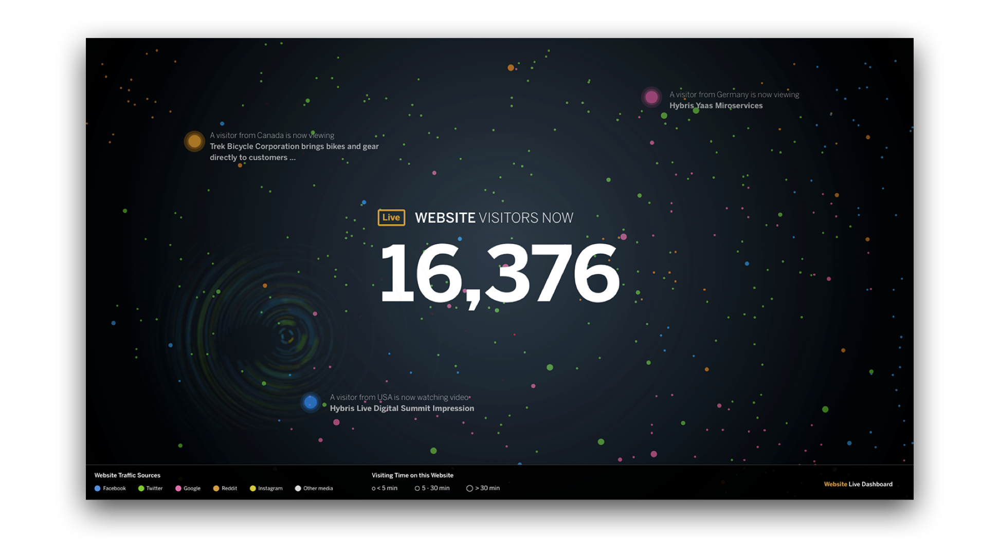

How popular is the brand’s website?
By visualizing website traffic, visitors get a general sense of how active the website is and the various entry points to the site.
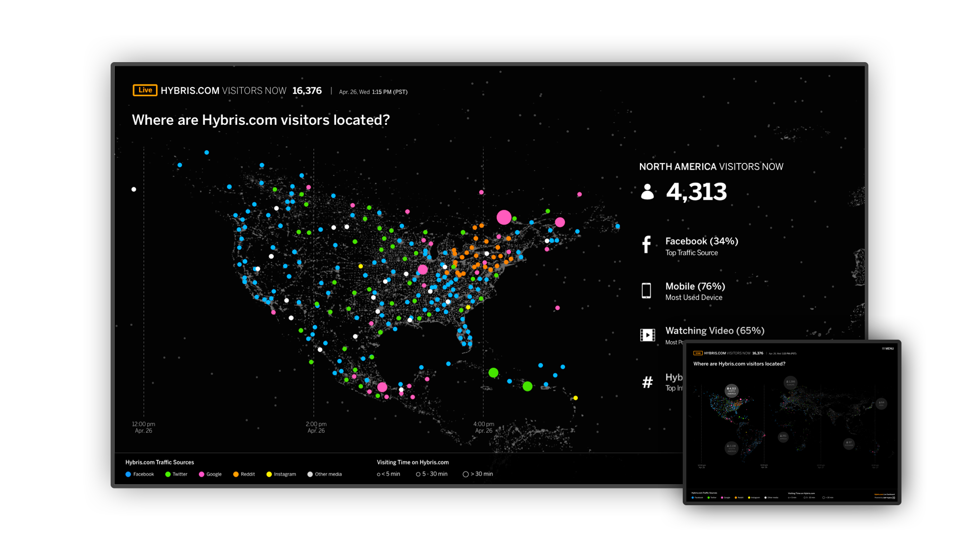
Where are most visitors coming from?
A geographical distribution presents a perspective on traffic flow. Stars from the universe rearrange into a map revealing insights on regions that drive most traffic.
What are most visitors doing?
Stars from the universe rearrange into clusters that represent the top activities of most users.
CHAPTER FOUR
Designing for better usability
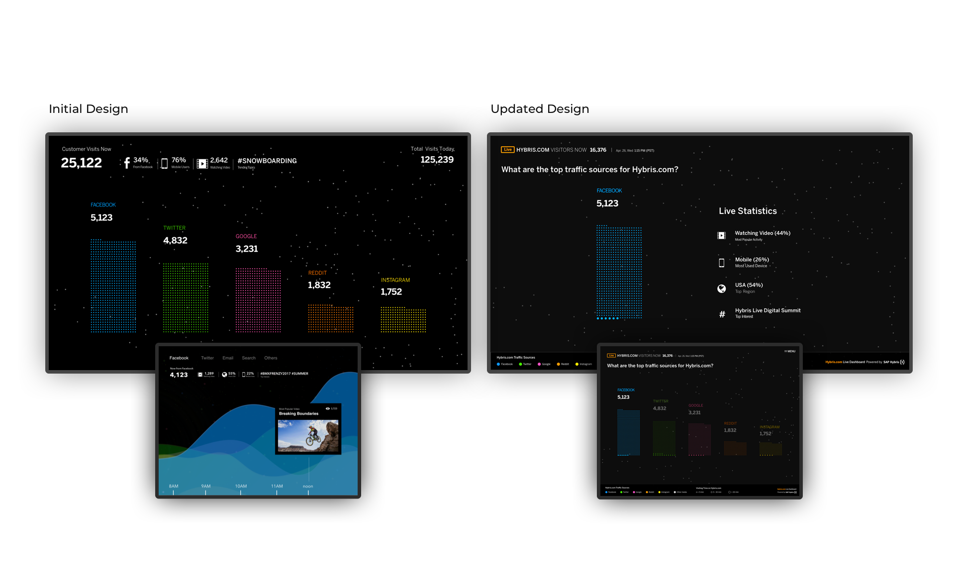
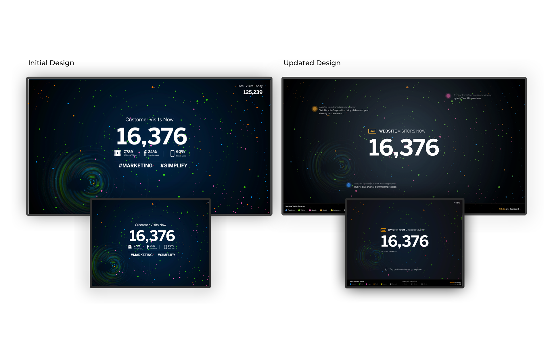
Going into the project, the challenge was unlike a typical project and was largely evident in learning how to design an interactive experience for the large screen in a public space. As we stepped into the domain of experiential design, our initial concept was designed to have the tablet serve secondary content that would complement the content on the primary large screen. In order to get feedback from users, we built a prototype and ran a number of usability studies in lobbies and indoor public spaces at SAP. The studies were in the form of passive observations and in-person walkthroughs, to understand the variety of ways users interact and perceive the display.
Dual display contributes to increased cognitive load.
The initial concept with secondary content on the tablet was found to be complex for users, and participants had difficulty knowing which screen to focus their attention to. Participants expected to interact with the tablet for only navigation purposes, and were not expecting to see new content. As such, the content of the large display and tablet was mirrored for most first-level pages, and this greatly increased the simplicity of the experience.
An abstract visualization invites more participation, but users need more context.
Although the initial concept leveraged animations to express the meaning of the stars in the universe, an added legend greatly helped in conveying the representation of the stars. In addition, the inclusion of instructions made the experience more inviting for participants to interact with.
CHAPTER FIVE
Learning & Outcomes
It is often surprising to learn how users discover a brand and its products, and the variety of ways in which digital marketing strategies inform users. The project was an experiment that leveraged the social potential of public displays to inform, entertain and educate audiences and a large number of users found different uses for the display. In designing the experience, we realized that the environment itself can influence user behavior and therefore, the setting matters a great deal to make the experience as inviting as possible.
People most often recall experiences that made them feel something; the use of storytelling as a method matters, and digital signage as a medium can be a highly effective tool to make a difference. This concept highlights the potential of visuals, environments and sensory applications to tell meaningful stories, and can be a powerful tool to inform an audience and their business.