Fiori Design System
Empowering Fiori makers with a single source of truth through a redesigned design system website
ABOUT
For a while now, SAP has been on a transformational journey in embracing design to establish itself as a juggernaut in enterprise software. Part of the promise especially to it’s customers, is to deliver a consistent user experience across its product portfolio, which sparked the birth of Fiori – SAP’s design language for the enterprise. However, with several recent acquisitions each wanting to retain their design brand, the challenge of harmonization is no simple feat: How do you turn a house of brands into a branded house? An executive decision aims to set right SAP’s course, by mandating all products to be designed on Fiori. And SAP seems to have the basic tools to accomplish this – an evolving design language and a design-led development approach. But is that enough?
Shortly before I was brought onboard, a research initiative was kicked off to understand how different teams at SAP approach design and development. It was eye-opening to realize that a number of product teams and acquisitions have their own UI libraries and design languages, with many of them recreating UI assets leading to inconsistent product experiences. Moreover, with differing choices in the tools used by product teams and a clear absence of a functional end-to-end design system, the road to scalability and consistency was clear.
ProjectBogotá aims to accelerate product development by empowering internal and external designers and developers with a single source of truth for everything related to Fiori.
The project consists of two major workstreams:
The Fiori Design System Website, a reference tool for Fiori makers across platforms that support web technologies, native mobile and conversational experiences.
The Fiori Toolkit, a Sketch Plugin that enables designers to rapidly create Fiori Apps using the latest assets.
I was brought onboard to lead a small team of designers to strategize and execute the redesign of the Fiori Design System website.
CHAPTER ONE
Planning our approach.
Straight off the bat, it was apparent that we were trying to foster change amidst a highly political landscape, with vested interests amongst a large number of stakeholders.
Our initial goals were to present a concept that proves value to designers and developers by bringing more efficiency in their workflow and consistency in the products they create. We kicked off the project with an 8-week plan to research our target users, understand design systems better and design a concept for the website that tackles the right problems.
CHAPTER TWO
Understanding our users.
While there were a number of users to potentially design for, such as Designers, Developers, Partners and Decision Makers, our research was focused primarily on the maker community. We interviewed designers and developers across different product teams and technologies, having varying degrees of experience with the creation of Fiori apps.

Using journey maps to paint the general approach of designers and developers, it was quite apparent that some of their key problems revolved around the consumption of the guidelines, and the resources they use to create consistent apps.
1
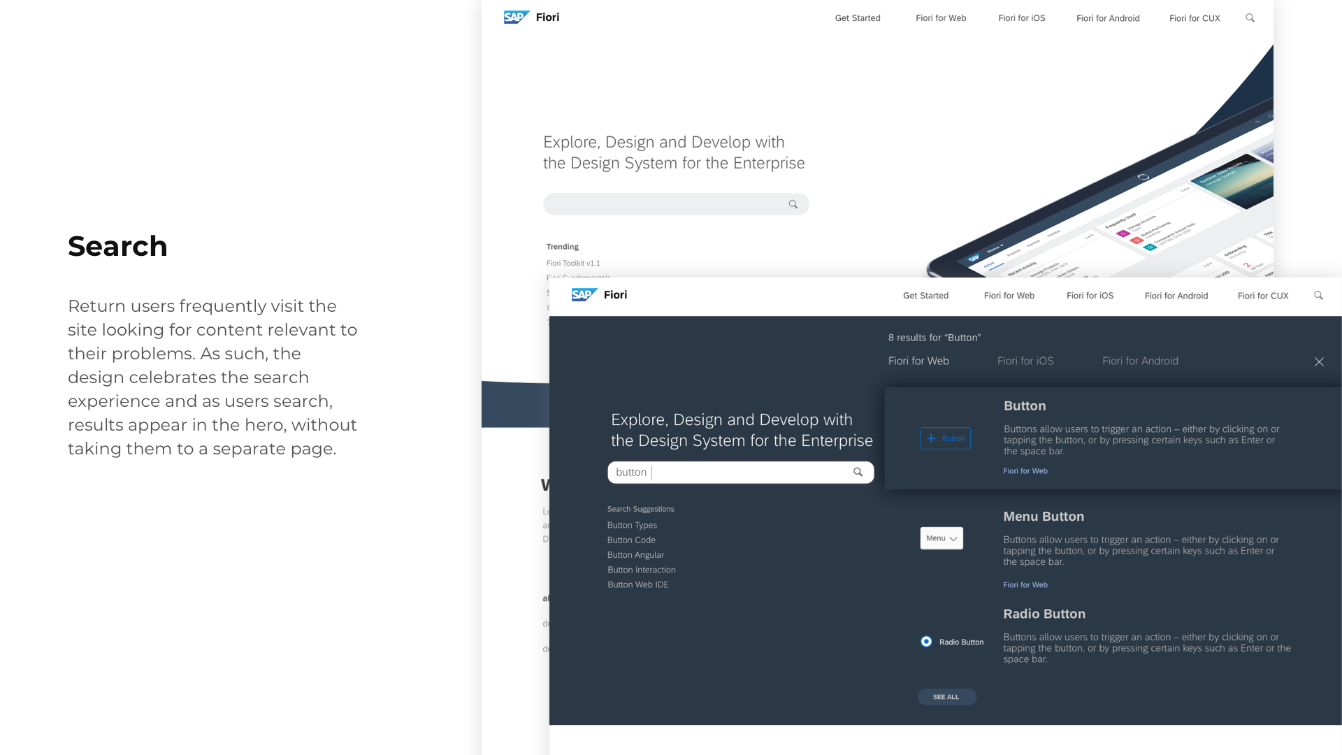
Most people are return users that arrive with a very specific intent.
2
Designers and developers feel like they are using different versions of Fiori. There are too many different sites to learn about Fiori and it’s hard for users to quickly find what they need.
3
The guidelines have too much information and it takes users too long to find the information they need.
Our goals were clear – design a website that serves as a single source of truth for designers and developers, and design the guidelines in a way that make them more consumable.
CHAPTER THREE
Understanding design systems better.
Compared to a few notable design systems out there, Fiori is far more complex and is more of a family of design languages supporting multiple technologies and platforms.
At the time, the powers-to-be at SAP Design announced Fiori Fundamentals, a move that decouples Fiori from its code base, giving developers the freedom to build apps on any web technology of their choice. This was a relatively new concept, and it was important that this was accurately represented in the design system.


CHAPTER FOUR
Defining the Site Architecture.
Going into the design phase, it was evident that the site would need to house a variety of content from a number of sources. As such, it was important to establish a taxonomy of pages to have clarity around how we classify and design a variety of content.
1
Home Page
Drive users to where they want to go
2
Category Page
Overview/Introduction and Navigation to Topics and Products
3
Topic Page
Overview and Navigation to Detail Pages
4
Detail Page
Provide all details for users to learn and consume
We explored a number of site navigation variations, and it came down to two options:
- A platform-first approach
- A role-first approach


Despite being more complex, we were told to adopt the role-first approach as it appealed more to our leadership. This was one of many challenges we faced through the course of the project – when leaders make design decisions without the full context of usability and ease of navigation.
CHAPTER FIVE
Designing the experience.
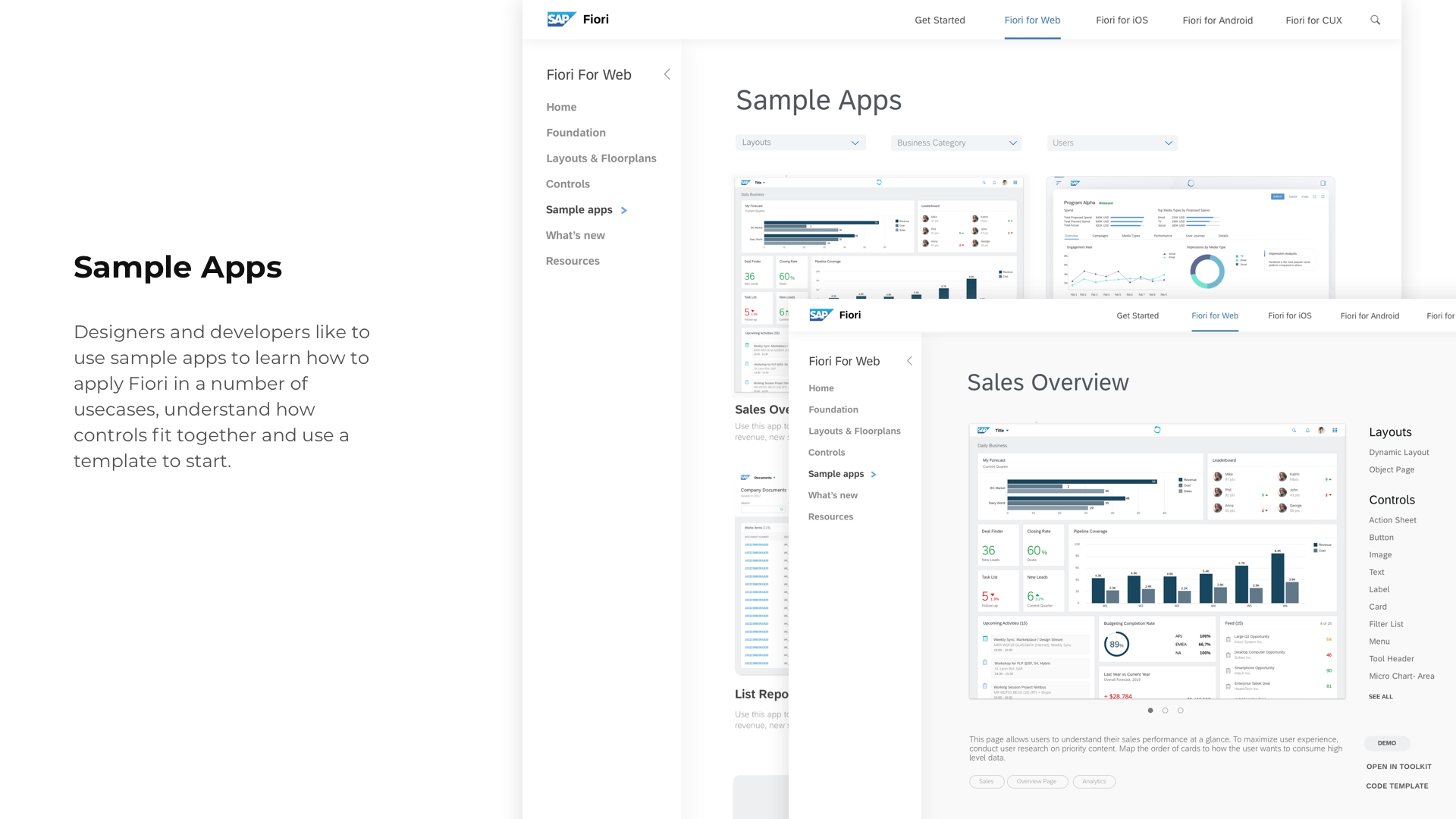
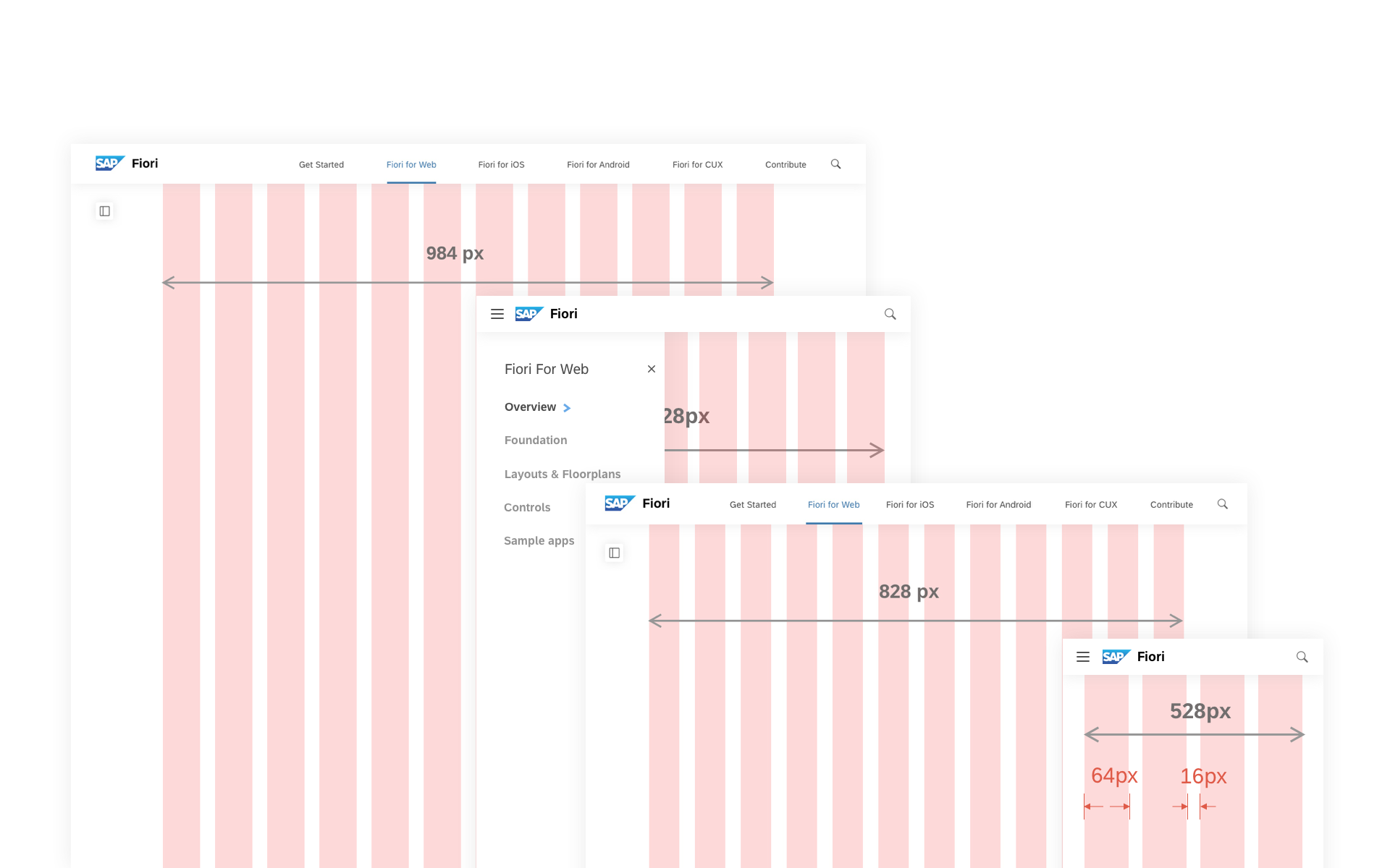
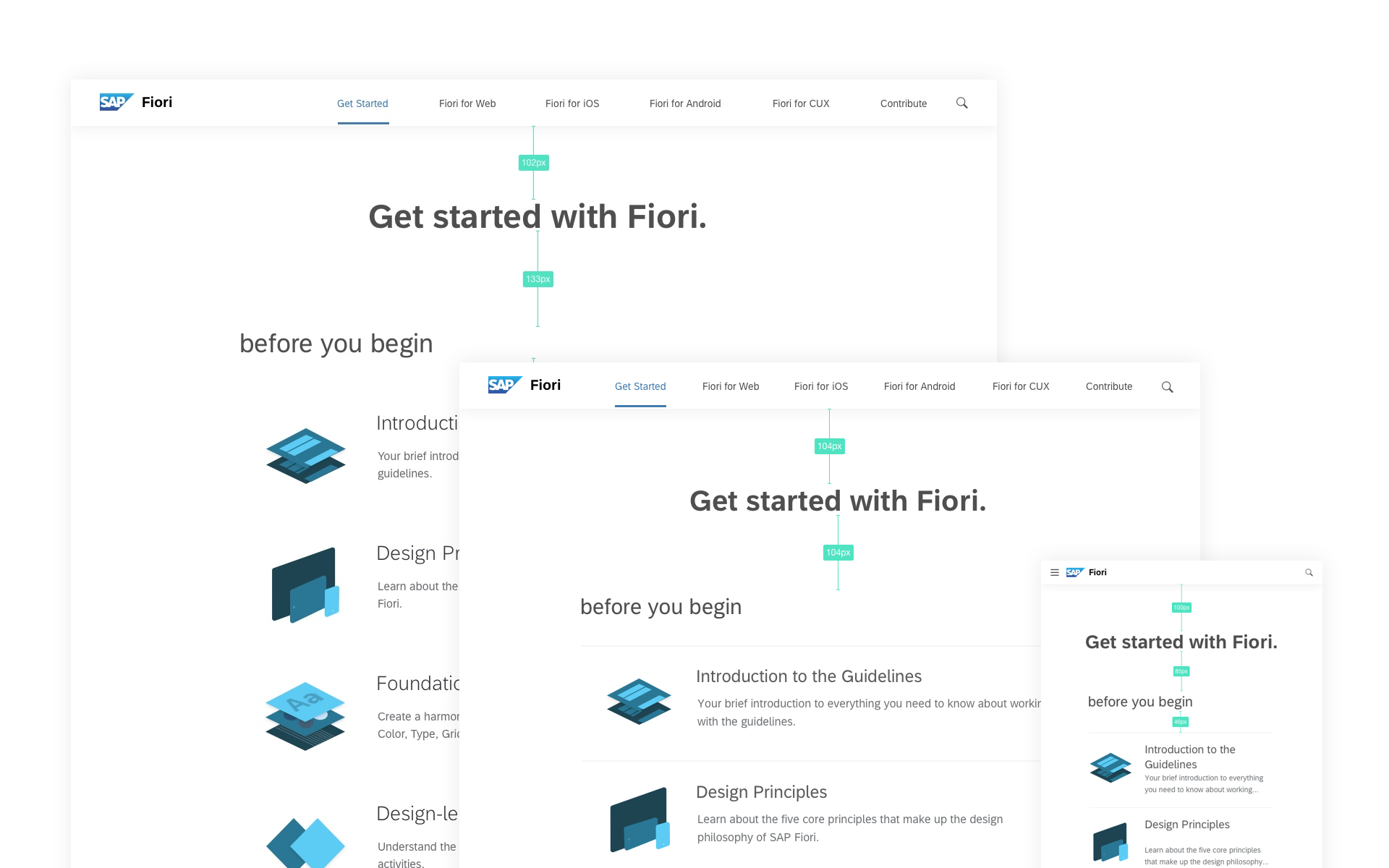
With a clear structure in place, our initial sketches for the website aimed to cater to return users who arrive with a specific intent of finding content relevant to their workflow. Initial research yielded that users want to stay upto date with the latest announcements to Fiori, have easy access to the component library, and benefit from resources to become better Fiori makers.

The design of the website was soon going to influence SAP Design’s web presence, and as part of a stretching exericse, we temporarily stepped outside of the SAP brand experience, and sought inspiration from a variety of eclectic sources to define a stylesheet that drives the website’s visual design. The outcome was a theme based on 3 key attributes: Bold, High Contrast and Minimal.


“I think separating ‘Design’ and ‘Develop’ is creating repetitive information.”
“I would like to directly click on ‘Fiori for Web’ or ‘Android’ as I know exactly what I am looking for.”
A number of usability tests highlighted our growing concerns around the unnecessary complexity around the navigation.
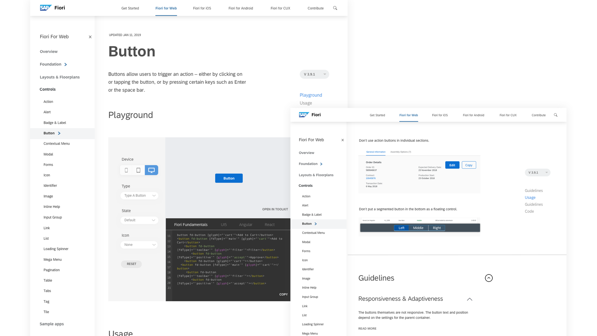
Citing feedback from users, we resorted to the simpler platform-first approach. As we designed more iterations to the landing page, we were asked to ‘sprinkle’ some of the Fiori brand experience. The final design of the landing page incorporated a number of Fiori brand elements such as the color palette, typography and new button styles for the web.
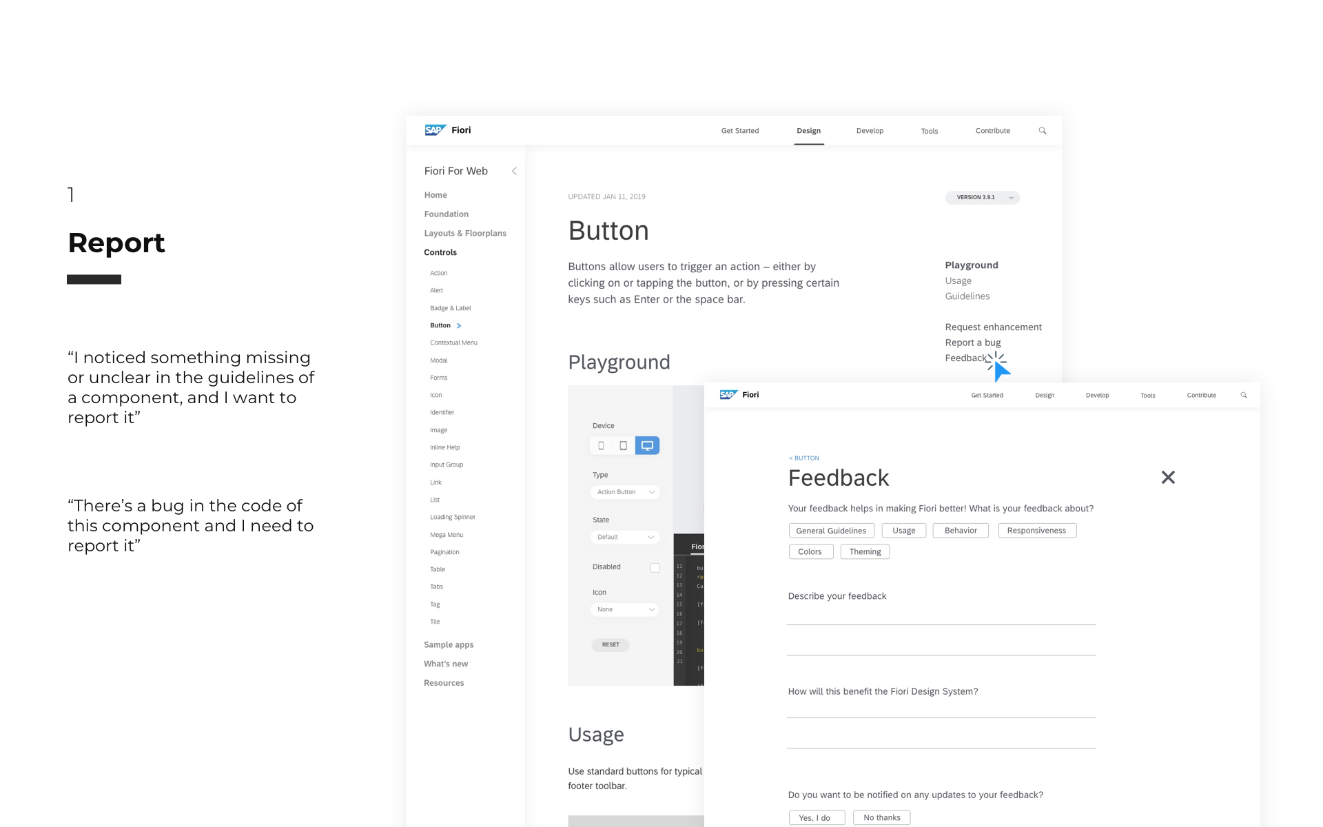
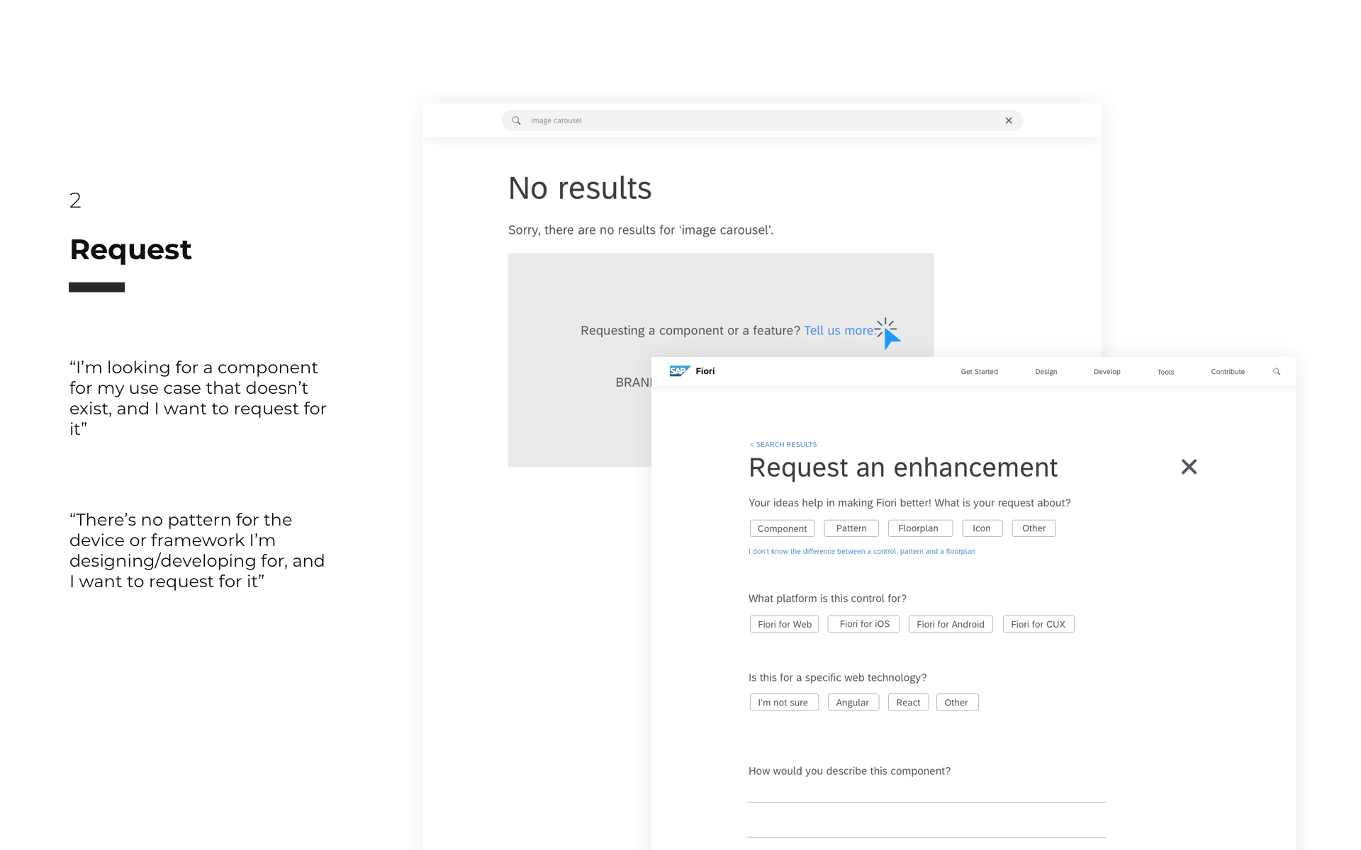
The Guidelines
Being a critical component of the Fiori Design system, the Guidelines seemed to be a thorny area for a large number of users. Designers find themselves sifting through a lot of information only to find something somewhat relevant, and often times don’t understand what controls to use or how to use them. In addition to the guidelines, developers have to refer to implementation guides which may not always be on the same version as the design guidelines.
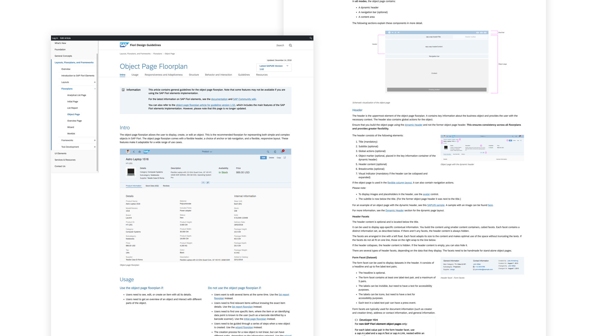
Our initial strategy with making the guidelines more consumable, was to reduce superfluous content and redesign information in many cases. By using small blocks of content, supporting imagery and interactive demos, these simplified details allow the guidelines to be more consumable. Using versions, designers and developers can align better on components.
CHAPTER FIVE
The Road to Product.
As the project continued to gain more exposure, it was soon turned into a program. And with more voices, came more stakeholders. We were evangelizing the potential impact of the project and as our engagement was drawing to a close, there was uncertainty looming over future of the project. Like many other projects I’ve worked on, development was never truly promised and it was challenging to advocate the push to development without a Product Manager in place. Once we had the support we needed, our next steps were to organize a workshop to discuss the road to product.
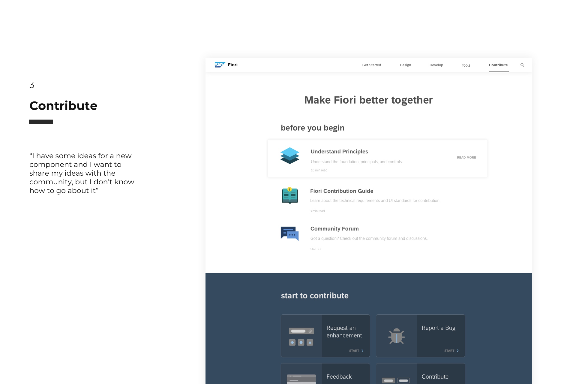
The goal of the workshop was to align on the future of the Fiori web experience with major stakeholders in SAP Design. The workshop allowed us to collectively define the vision of Fiori Experience, determined the minimal viable scope, developed topic work-streams and a project timeline to realize the vision. SAP Fiori aims to be the design system for the enterprise, and it needs to tap into the power of open source to truly scale. And thus, the topic of Contribution emerged as a new workstream.

CHAPTER SIX
Going open source.
Prior to the workshop, our research on contribution systems allowed us to establish a strong point of view on a number of areas of opportunity. By interviewing more designers, developers and subject matter experts, we identified the mechanics of the contribution system to be set in place.
CHAPTER SEVEN
Revisiting the Guidelines.
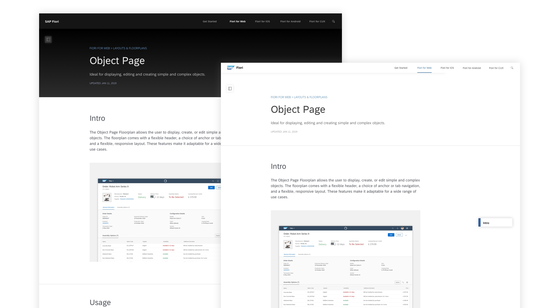
Another major workstream that emerged from the workshop was the Guidelines. With Fiori being a large family of design languages, the effort around redesigning the guidelines would need to harmonize across Web, iOS, Android and CUX. Web was the largest and most complex design language, and our efforts were focused on defining a content template that could potentially apply to the other platforms as well. Our first set of iterations on the guidelines did not fully solve the problem of allowing users to rapidly consume content. A quick re-examination of user intentions helped us get closer to a more viable solution.
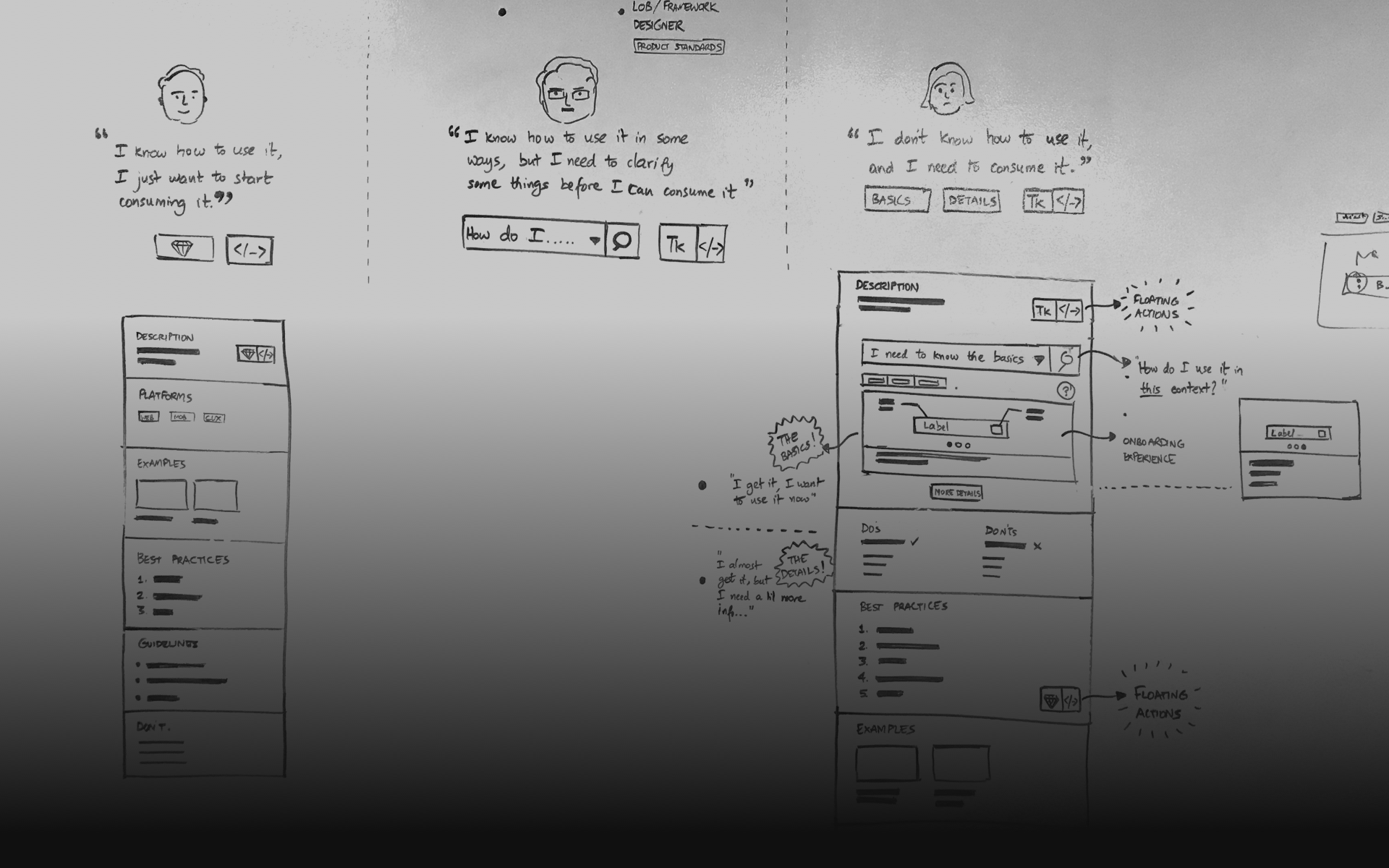
Some of our users need the quickest takeaway possible, interact with control and while others need deeper dives. As such, the new template introduces short form and long-form content. The short-form allows users to interact with the control, customize it, understand how it works, clarify quick parameters around its usage and consume the asset or code to start working right away. Below the fold is the Long-form content which is a deeper dive into the guidelines.
CHAPTER EIGHT
Working with Development.
By this time, the team was enthused about working with a full team that was now staffed with a Product Owner, Program Managers and a Development team to realize our minimum viable product. However, this was no easy journey.
Our first challenge was to change the operating mechanics of the larger team, and have design work directly with the developers, as opposed to interfacing with a production lead. As a project/design lead, it was challenging to navigate a political landscape to streamline how we communicate, plan and execute design sprints as a team. Working on 1 week sprints, we worked closely with our Product Owner to defining Epics and User Stories, and review and iterate on designs with development. With Abstract as the choice for managing our Sketch files, we produced responsive designs, visual and animation specs for a number of components over multiple sprints. This is currently underway.
CHAPTER NINE
Learning and Outcomes.
It’s not often to come across opportunities in a large organization that can truly foster change and create lasting impact. Often times, such change has to come from within. The project was an eye-opener to me in understanding how design systems are about empowering makers to accelerate productivity in their workflows, and spend their energies in areas that truly matter. This marks a major step for SAP in working towards establishing itself as the design system for the enterprise.
The project was fraught with a number of challenges – some organizational, political, resource-related and many around the design problem itself. In the absence of a Product and Project manager for a large part of the project, my role as a design lead extended into areas around managing relationships, resources and often times massaging my way through a political landscape with one-too-many stakeholders. The project is currently underway and is slated for a product release in September 2019.